Peoplesafe Guidelines
Introduction

Peoplesafe gets emergency help to people at work, wherever and whenever they need it. Founded in 2001 to protect the most vulnerable workers, it is now the largest provider of workforce safety services in the world. It protects lone workers, hybrid teams and whole workforces, and every alarm goes to its own 24/7 Alarm Receiving Centre.
Logotype scale
72px

60px
48px
38px
30px
24px
18px
Use the logo as one piece of artwork. Keep the symbol and the name at their supplied size and spacing. At small sizes, check that the P and the lettering stay clear, and use the symbol on its own when the name becomes hard to read.
Colour versions
Our values
Our values shape how we work with each other, with our customers and for the people we protect.

Icon

Care

Partnership

Challenge
Each value icon is drawn on the same square as our P symbol, with the same bold, solid shapes. Their colours come from our gradients, so the values always sit naturally beside our logo.
Core palette
Yellow
Navy
White
Yellow is for the primary call to action and highlights only. Navy carries headings and dark backgrounds. White is the page.
Accent colours
Blue
Teal
Pink
Orange
Use the accent colours only where an extra colour is needed, such as graphs, charts and infographics. Use them sparingly, so they never outshine Yellow.
Colour proportions
Lead with White and Navy. Keep Yellow small so it always points to the next step. Accent colours only appear where an extra colour is needed, such as graphs and infographics.
Readable combinations
- Navy on White12.3:1AAA
- White on Navy12.3:1AAA
- Navy on Yellow6.9:1AA
- Blue on White Links only4.8:1AA
- White on Yellow1.8:1Fail
- Yellow on White1.8:1Fail
Use Navy text on White and Yellow, White text on Navy, and Blue for links on White. Yellow and White are too close in brightness to carry text over one another. AA meets WCAG for normal text.
Type system
Bold is for headings and buttons. Headings use balanced line breaks, so no word sits alone on the last line.
Regular is for body copy, links and labels. Weight never changes on hover, so text never shifts.
Type scale
Protect your people
Protect your people
Protect your people
Protect your people
Protect your people
Protect your people
A clear step down from headline to supporting detail keeps every page easy to follow, with size and weight doing the work.
Tone of voice
Peoplesafe sounds like a trusted safety specialist: confident enough to lead, clear enough to understand and always focused on protecting people. Write in plain UK English, one idea per sentence, and keep safety serious without making it frightening.
- Short headline
Protect your people.
- Headline
Protect your people. Wherever. Whenever.
- Brand statement
Peoplesafe gets emergency help to your people,
wherever and whenever they need it. - Introduction
A simple way for employees to raise an alarm, through an app or a dedicated device, answered by trained operators around the clock, so no one ever feels alone at work.
Lead with the useful answer
Answer first, then add the context that makes it useful.
Serious, not frightening
Describe risk factually and in proportion.
Confident, not absolute
Use approved claims precisely. An average is not a guarantee.
Photography
Show real people at work, in the places they work, in natural light. Keep the person and their task at the centre of the frame.
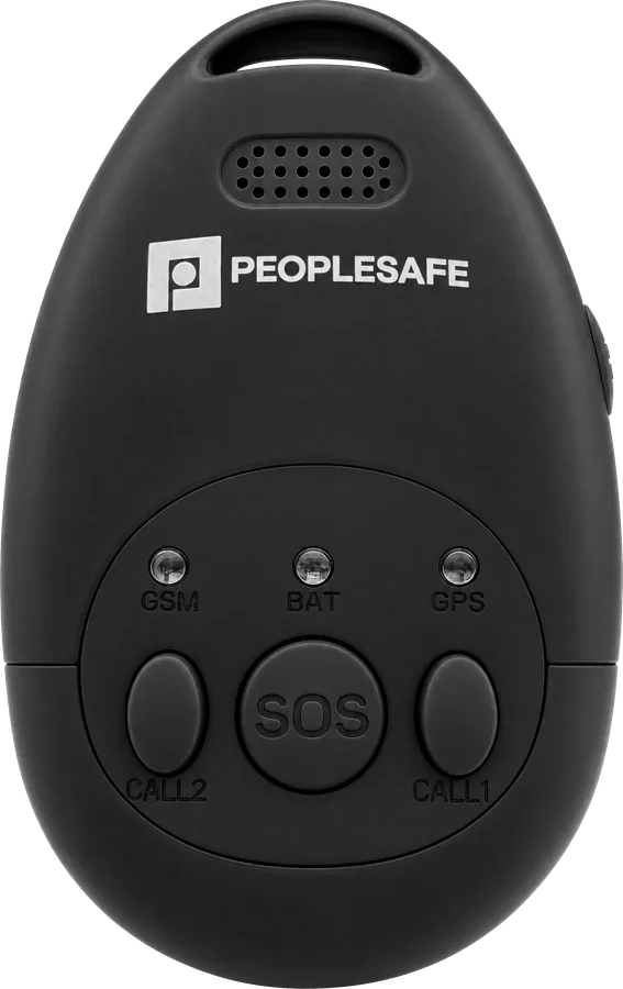
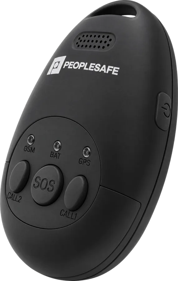
Products
Logo
Full Colour
Reversed

White
Icon
Yellow

White
Value icons
Care
Partnership
Challenge
Typography
Basis Grotesque ProOur typeface is licensed, so it isn't included in the downloads. Contact the marketing team to request access.(emails marketing@peoplesafe.co.uk)More information
For questions about the brand, or for anything you can't find here, contact the marketing team at marketing@peoplesafe.co.uk.